The client for this campaign is a major motion picture studio, making the initial design problem first and foremost the crowded field and sheer expanse of an international premiere. We have all seen at least one movie commercial that gives away a bit too much of the plot, and so the design of a premiere must capture the prospective audience's imagination and do so in multiple formats, while not revealing the entire storyline. I was tapped to conceptualize the imagery for posters and multimedia merchandise.
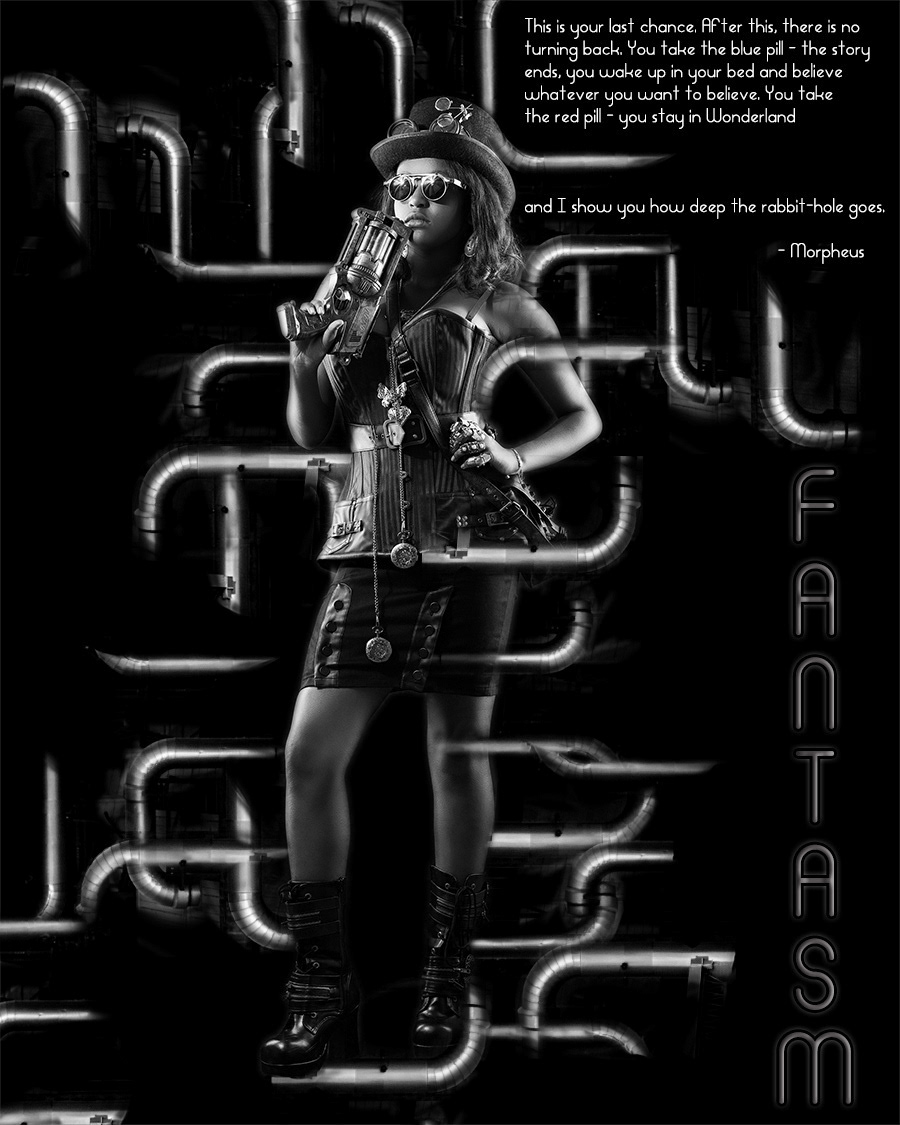

I met with the screenwriting team to discuss key elements of the movie concept that they felt should be highlighted in the advertising. We all pasted and arranged our ideas for cues, easter eggs, and cinematic tips of the hat for an established genre. My concept for a science fiction movie opening started with a class photomontage project using a stock full figure portrait from our textbook, and some original images I took of a nearby works plant. The quote courtesy of The Matrix, all the squirmy ducts are a tribute to H. R. Giger's stuff, continuing with a pipeline twist.
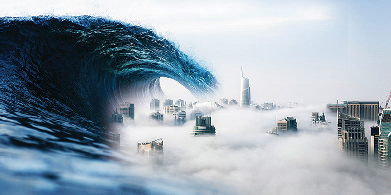
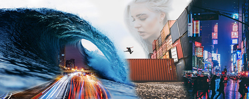
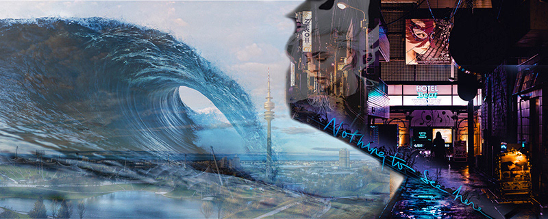
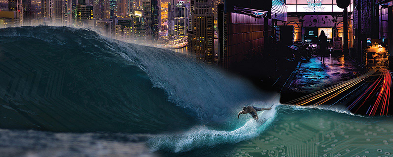
The idea originated in recollections of William Gibson's novel Neuromancer. Not wanting to be yet another Blade Runner or Ghost in the Shell knockoff the first run of draft compositions expanded on a port city motif.
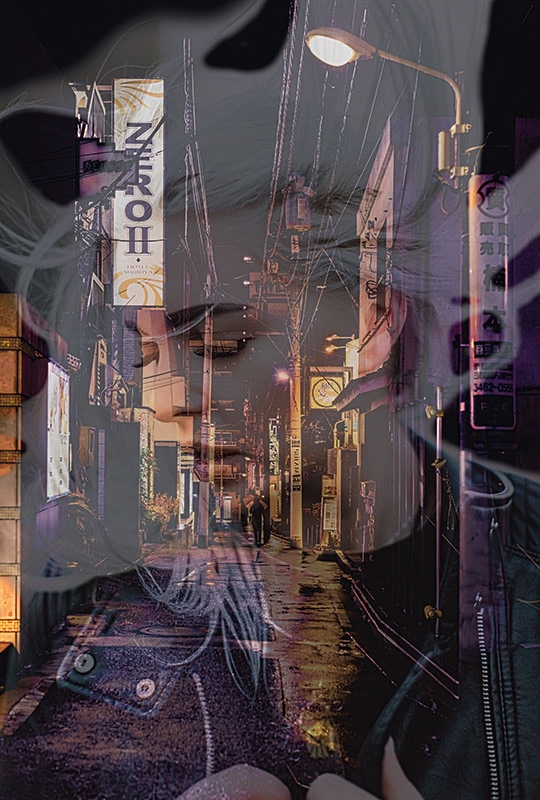
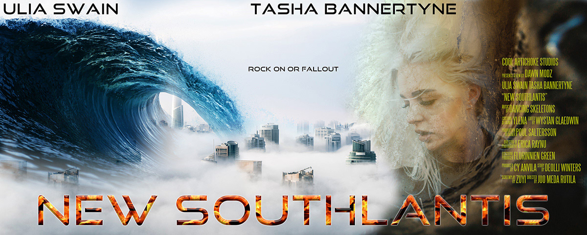
So the challenge for a 40x16in concept was to remember what it would look like on the side of a building when one doesn't have a full-scale printout to stare at. I tried this one out and then it occurred to me this looks a lot more like a disaster movie than a science fiction. The credit list needed to be prominent enough and outside of a busy area [oops, that first one stuck in the middle of a barrel wave] and at the same time not overtaking the imagery.
Looking forward to the latest of Neo and Trinity, I remembered their arrival at a Victorian mansion in none other than a '65 Continental. Lots of cyberpunk has a future retro-noir register. So somewhere between 8GB RAM and an 85-mod run through Fallout 4 I sat myself down at a Remington Rand, hashed out a character sketch for a fanfic who meets up with NPC essentials like the Deuce at a post-deluge Charleston crossroads, on her quest for a 60w amp stack. The tagline does get lost for any number of reasons. I was trying to reconcile the credit list and the main actors' names so the middle was relatively clear. I printed out a full color copy and put it up on a wall; another issue came up with the CMYK transference for some of the many color areas, and would necessitate refining the values for print that will not clearly show up, such as the title made with a Difference mode.


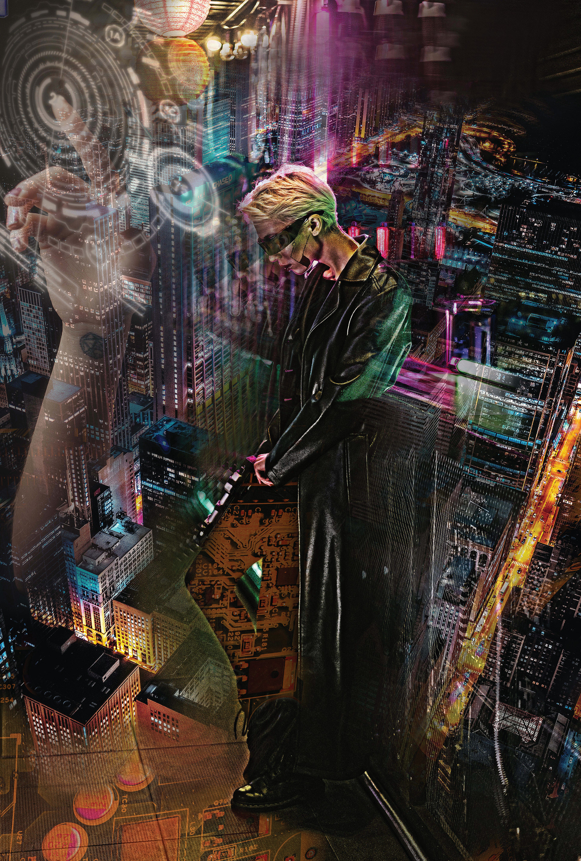
Returning to the original image from the class exercise, Fantasm derives its title from the word for a ghost and fanfiction or fanbase. A metaphor of cyberspace as a limitless ocean works centrally in the movie concept, as in the first image capturing the delicacy of life foregrounded by a body of open water.
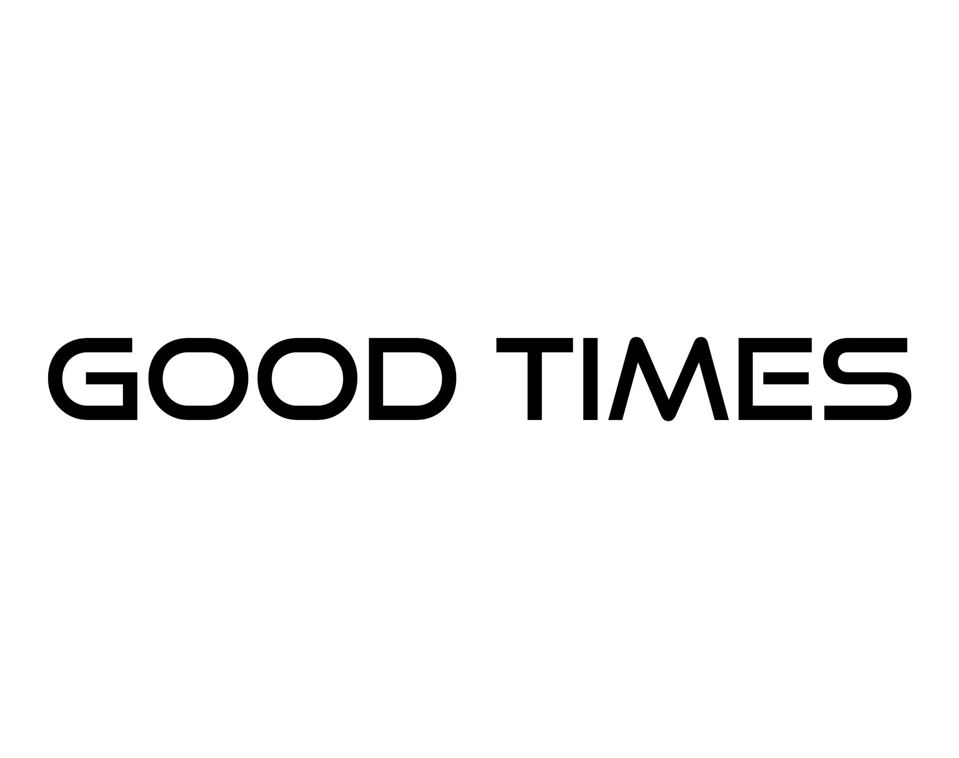
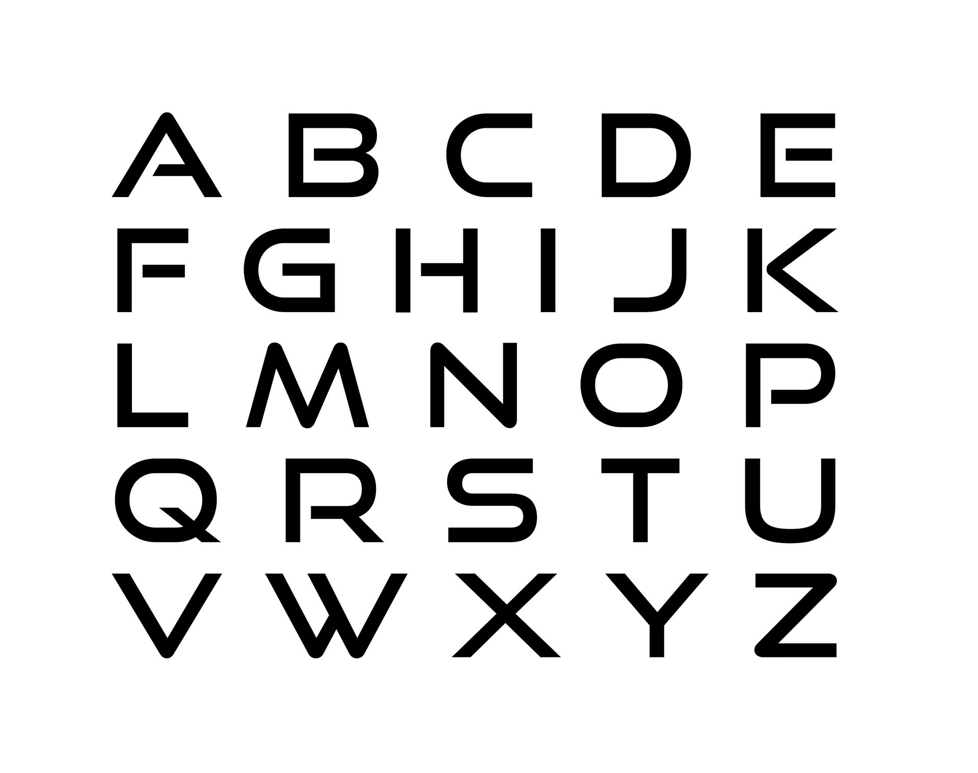
Good Times typeface mimics the lettering found on Pontiac automobiles 1989-1994 and is touted by its foundry as an 80s techno showpiece. Broad geometric strokes provide opportunity to show the circuit-sea using multiple layers of Exclusion, Overlay and Linear Burn. Layering and transparency levels reinforce the idea of a ghostly or hallucinatory presence.
The plot centers on an exploration of consciousness. Characters become entangled in a conflict between corporeal reality and virtual reality gaming. This recurring trope of liminal spaces and states of being sometimes blurs the genre lines between obvious science fiction and realistic drama, such as David Lynch's 1993 television miniseries Wild Palms. My concept for Fantasm draws on narrative frames like broadcast television, social networking and of course games.
As a theatrical exclusive release, the campaign includes soundtrack and special edition merch.
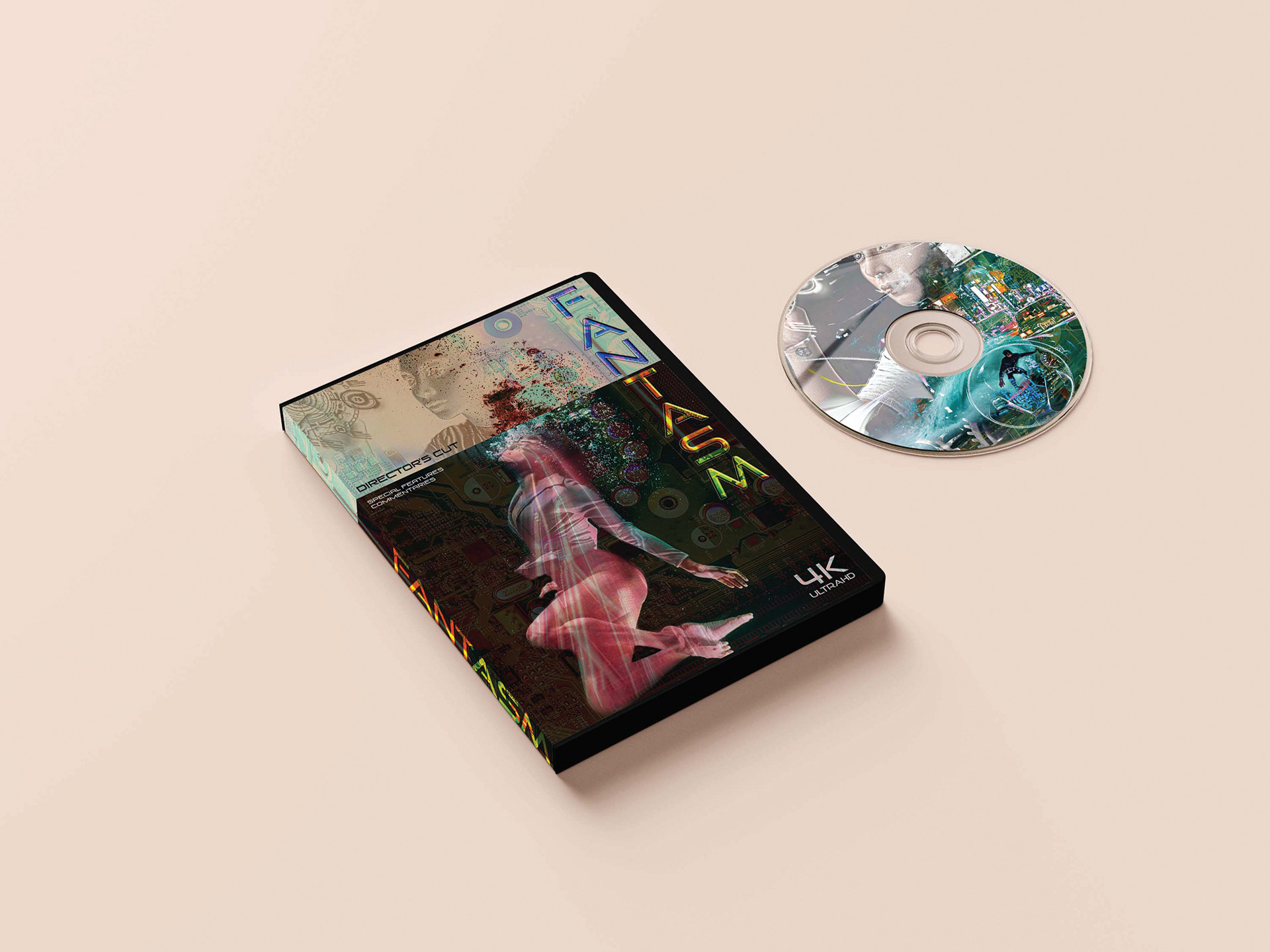
Movie posters typically feature complex imagery with a huge range of colors and textures, levels, and opacity adjustments. Many versions of the initial marquee images were compared side by side to determine the best possible versions for both CMYK print and RGB online uses, since some prospective mobile applications might possibly afford color options outside the normal print gamut. These possible variations between print and web versions needed careful consideration so as to not present jarring contrasts between, say, the cover of the HD disc issue and one of the theater chain mobile ads, and break the continuity of the overall branding.
Movie plot comes from a novel, which goes into a special printing release on opening day. Displaying title page and frontispiece became problematic with smaller mockup formats, as did the cover. Like the other instances of Fantasm imagery, the details and finer color contrasts do not show up in miniature.
Neon night cityscapes play a contrasting sea of artifice.
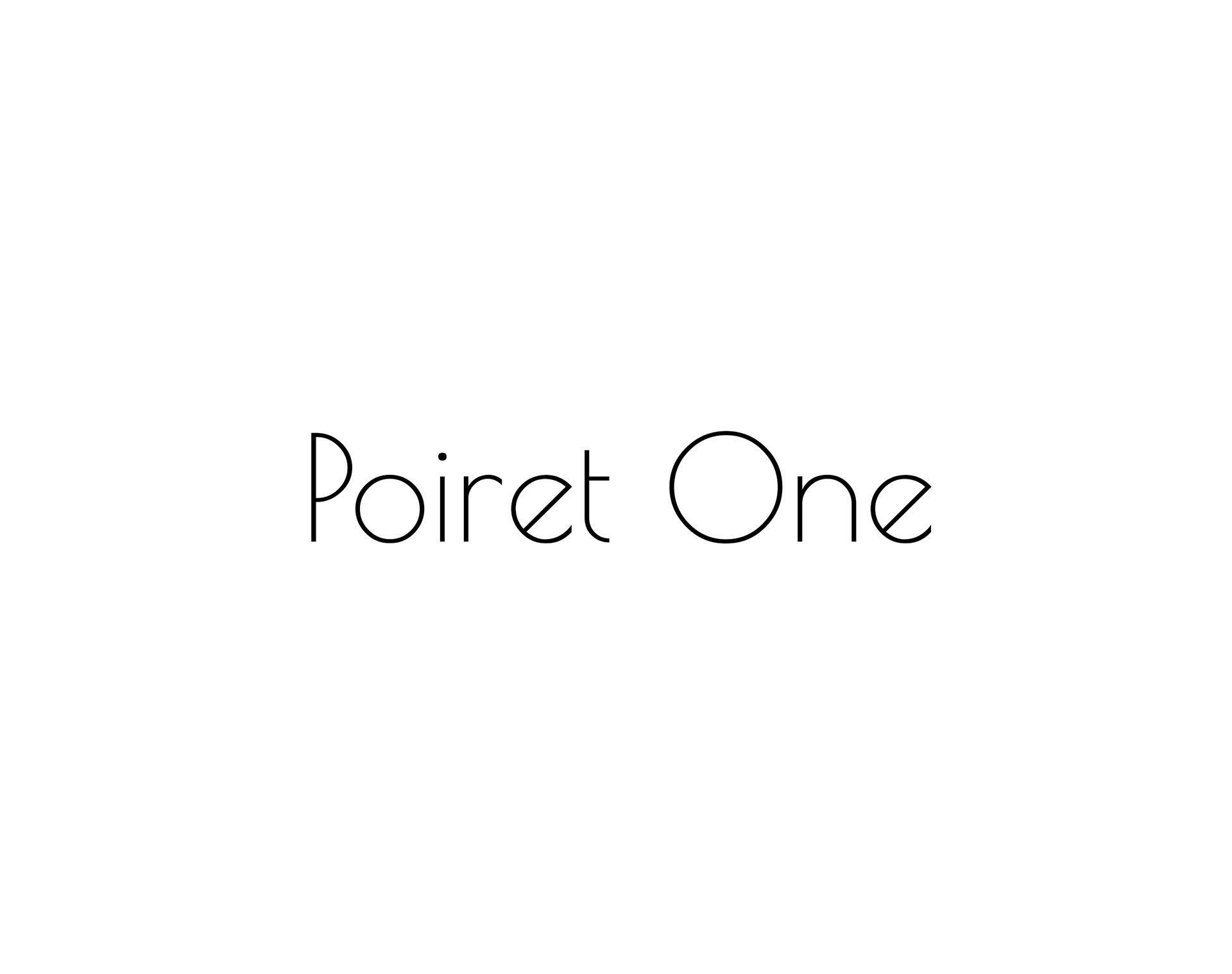
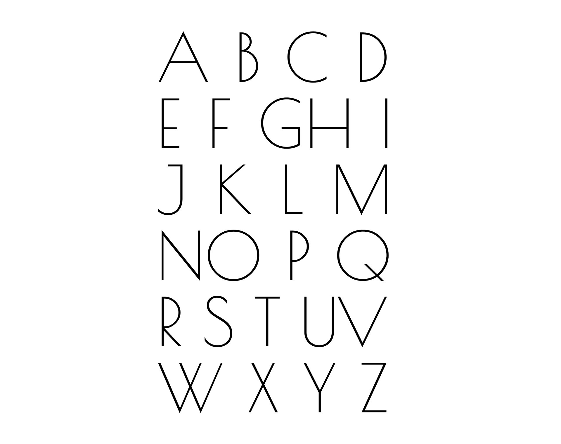
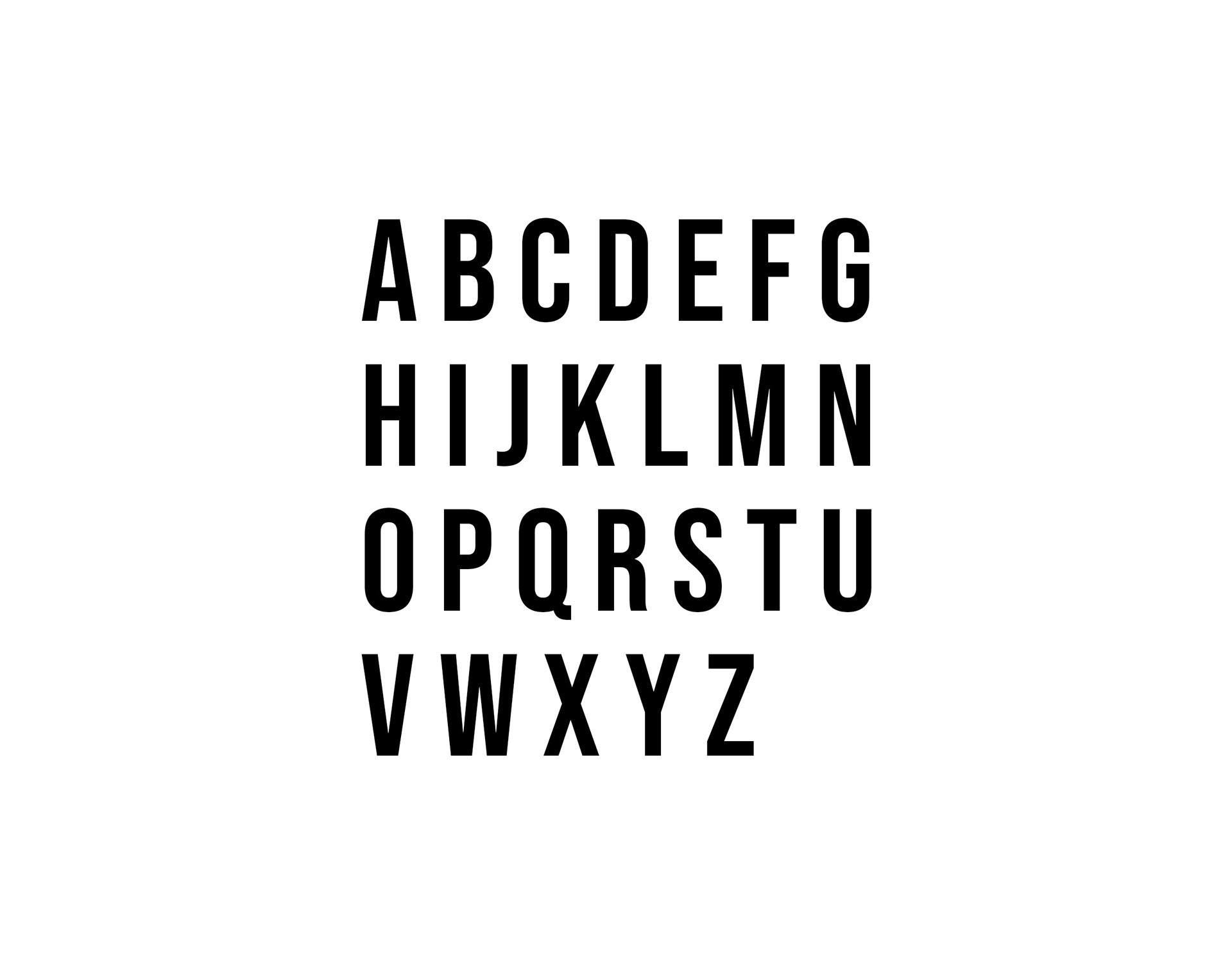
Poiret One makes an elegant title in print, but zoomed out too much or reduced too far ... not so much effect. In order to have the Stag Sans subtitle visible, along with the Arcon author and publisher, the mockup size accommodates Poiret. Movie title has been purposefully chopped on the far right to suggest cryptic messaging or glyphs, and with the spine lettering does not leave the viewer guessing. Author's name on cover uses Bebas Neue, the premiere advertising top left in Ethnocentric. Like Good Times this one has a marquee vibe [albeit a curious naming].

Showing just enough to interest both the core audience and possible newcomers to the genre required a design strategy that acknowledged storytelling basics. People are interested in stories about people more than expositions of concept, so the presentation of images related to the premiere needed to remember character in relation to scene and plot point. Each design element became an analog to moments in the narrative frame.
